
A data visualisation on Formula 1
25 Years on the Fast Track
Client
Shehryar Saharan (Prof. University of Toronto)
Year
2025
Audience
General, F1 Fans
Tools
Illustrator
Type of Work
Coursework
Approach
Large Poster
Description
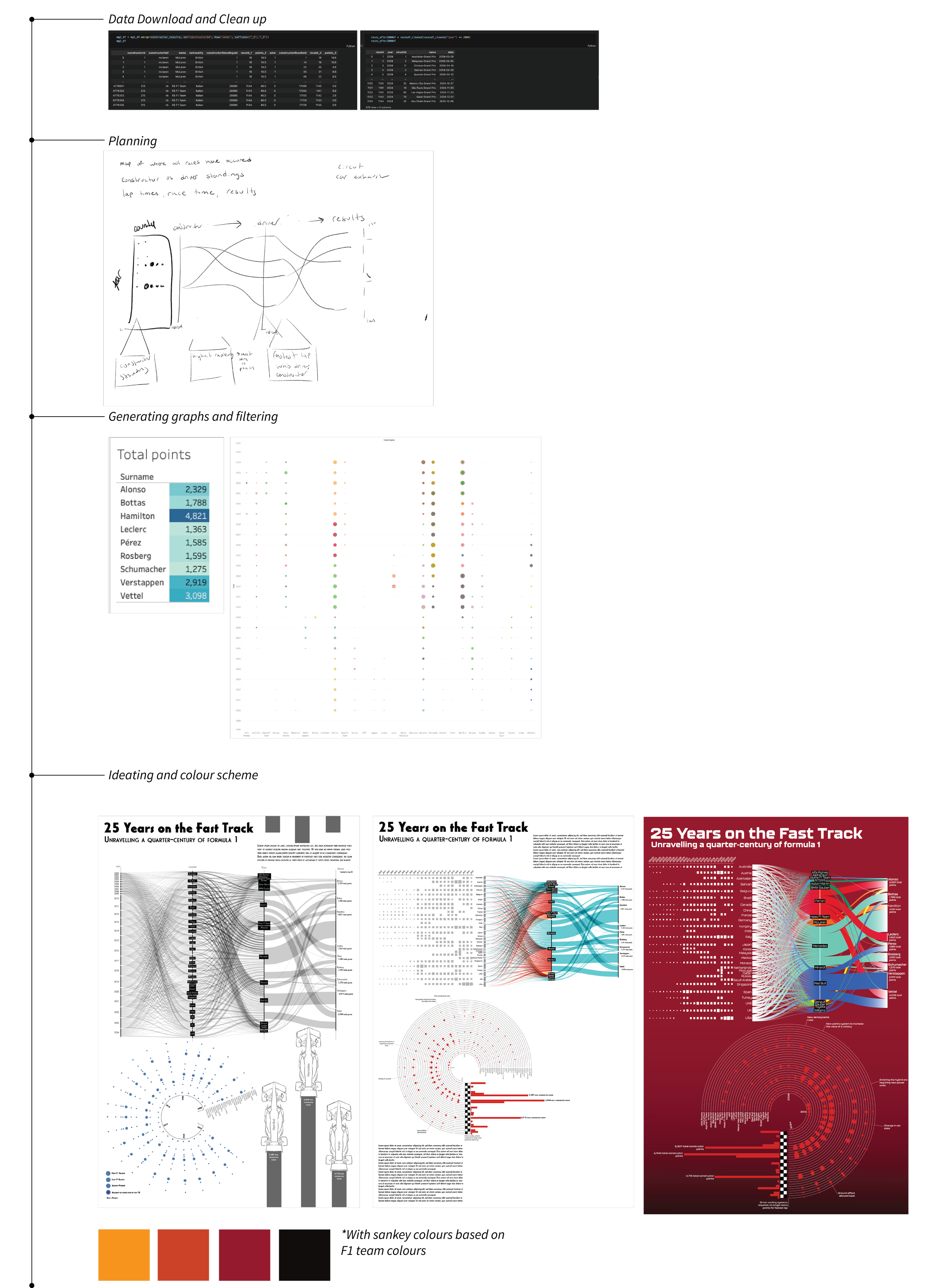
The project involved sourcing and refining a dataset from Kaggle that chronicled Formula 1 driver and constructor scores dating back to the 1980s. By developing a Python script, I streamlined the data to focus on the last 25 years, ensuring its relevance and clarity. To create an eye-catching visual representation, I utilised a blend of Tableau, RawGraphs.io, and Adobe Illustrator. The resulting design was crafted with the intent of appealing to Formula 1 enthusiasts, transforming the data into a poster that could easily find a place on the walls of any fan's home. The final piece not only captures the essence of the sport but also makes the statistics visually engaging and accessible.
Data Clean-Up and Ideation
The data clean-up and ideation process began with importing the dataset into a Jupyter Notebook, where I used a Python script to filter the data to focus on the years 2000 to 2024. This selective cleaning ensured that only relevant information was retained for further analysis. With the refined dataset, I utilized rawgraphs.io and Tableau to create an initial comprehensive dashboard that showcased a Sankey diagram, a radial chart, and a small bar graph representing the top constructors.
Upon reviewing the first draft, I realised the Sankey diagram posed interpretative challenges, prompting a redesign where I divided it into two side-by-side visualizations for clarity. Additionally, I adjusted the radial graph's orientation for better legibility and incorporated a bar graph depicting all constructors' points. To enhance visual coherence, I carefully selected colour palettes that reflected the F1 teams' branding while ensuring harmonious hues complemented these selections.